Pumaverse
Forever. Faster. Staged as a cyber-future event.
An event identity for Pumaverse ‘23, Puma’s global “Forever. Faster.” performance ethos, staged as a flagship culture event for its India community with a cyber-futurist visual system.
Overview
Puma’s global brand ethos is “Forever. Faster.”: built for every sport, everywhere. Pumaverse ‘23 is Puma India’s flagship community event, and it needed to translate that same global performance energy into a single, culture-forward event identity: part sport, part sci-fi.
Challenge
Build an event identity bold enough to feel like a global sporting moment rather than a local activation: a logotype, a badge system and a key visual language that could carry the same energy across a poster, a lockup and a HUD graphic.
What I did
- 01Event logotype design
- 02Badge & seal system
- 03HUD graphic language
- 04Key visual direction
- 05Campaign layout system
Approach
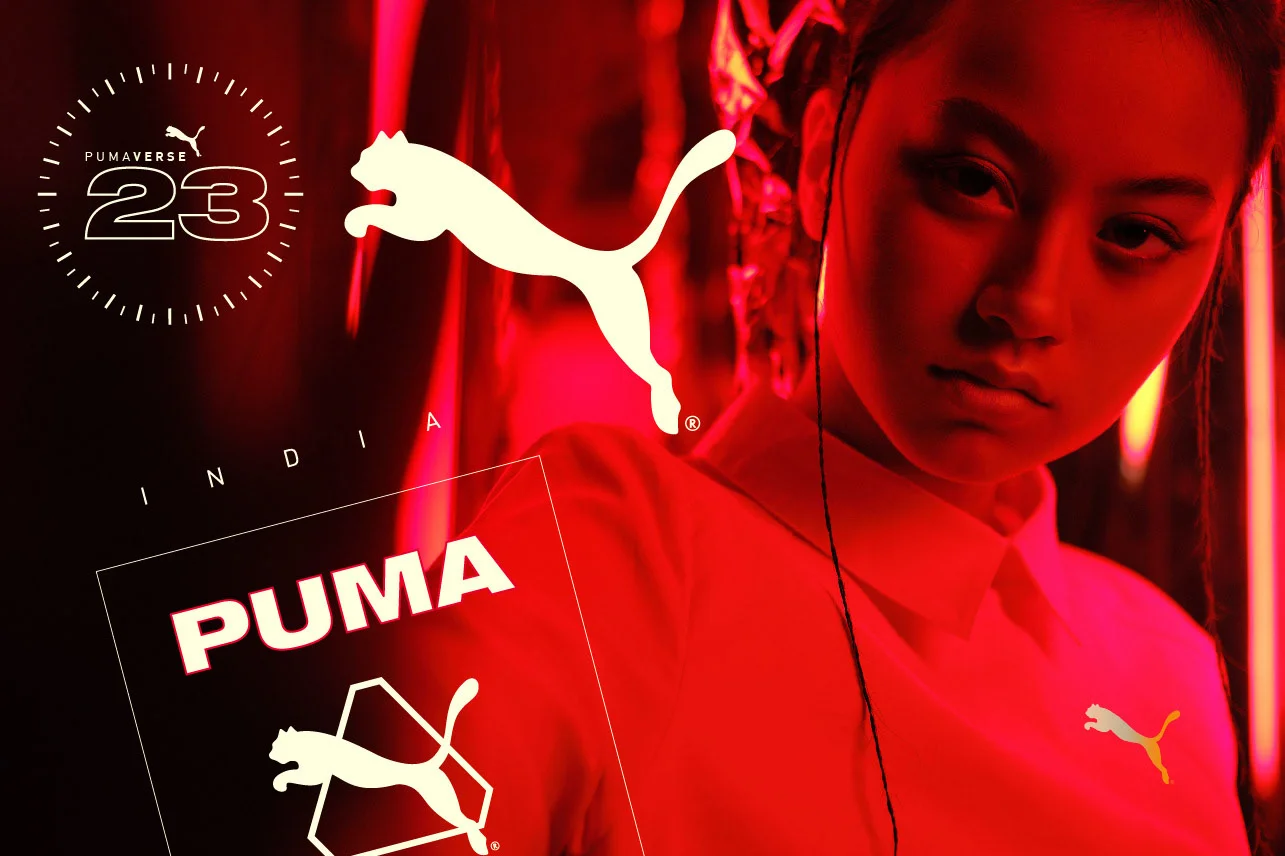
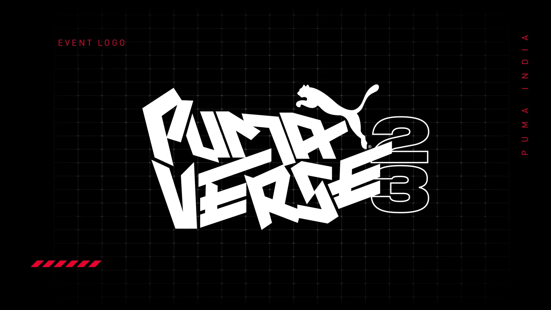
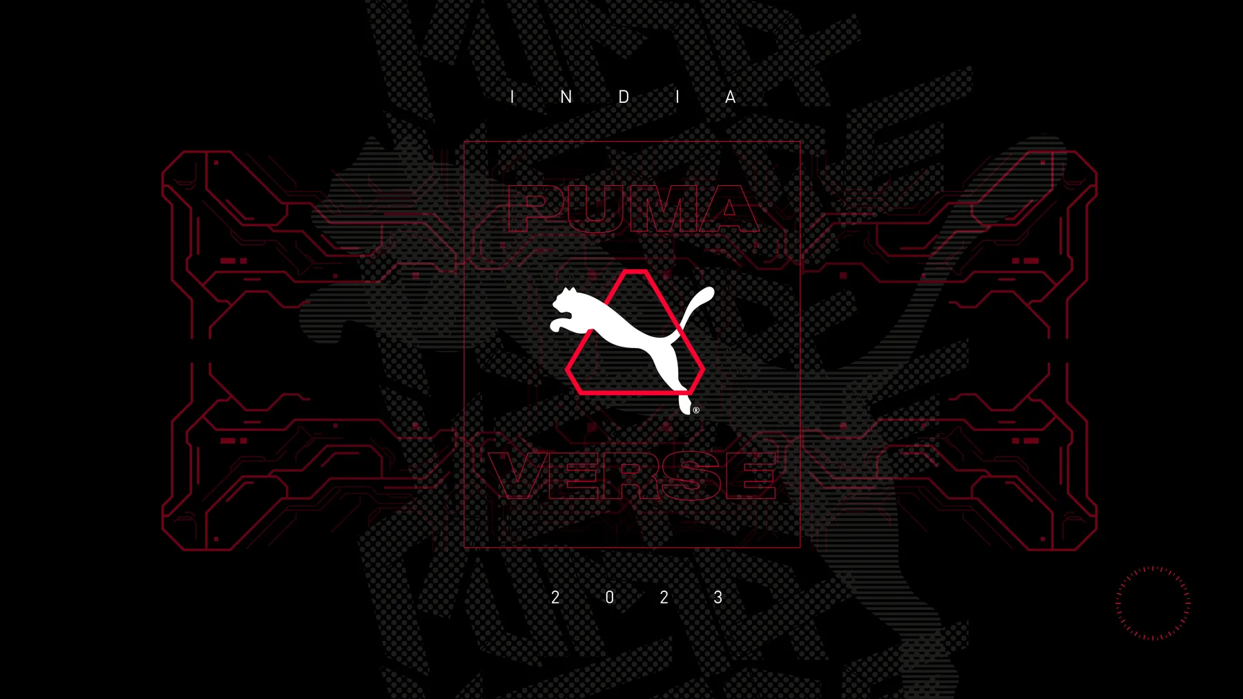
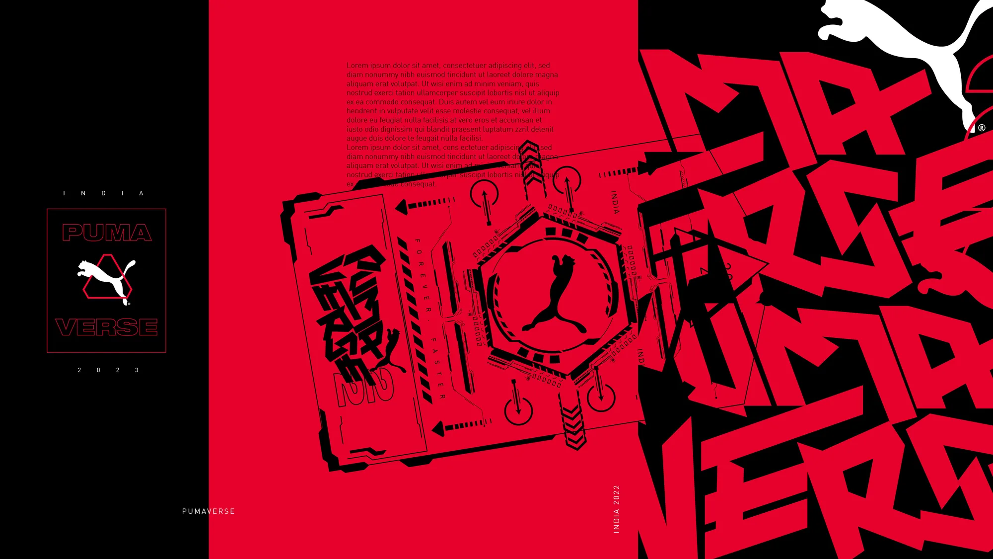
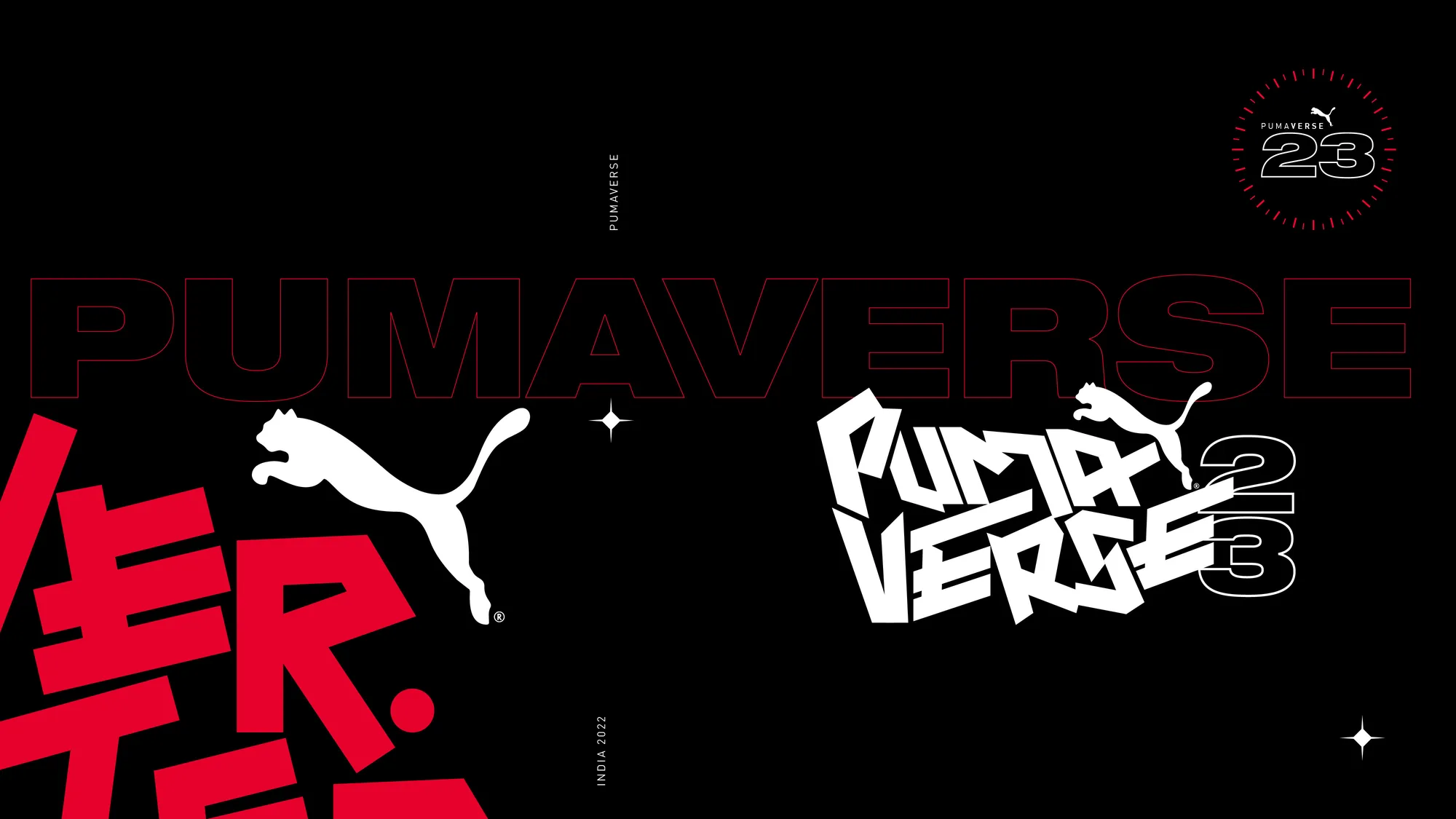
The event logotype is hand-built (sharp, graffiti-cut letterforms that read fast even standing still), paired with a circuit-line HUD system borrowed from sci-fi interfaces: hexagonal frames, radar dials, a “23” stopwatch mark. That same HUD language wraps around the leaping cat in the formal badge lockup, and reappears as an AR-glasses overlay in the campaign photography, so the whole system reads as one idea: performance, rendered as a future interface.
The system
- Event Logotype
- Badge & Seal Lockups
- HUD Graphic Language
- Key Visual System
- Campaign Layout Grid
Design development
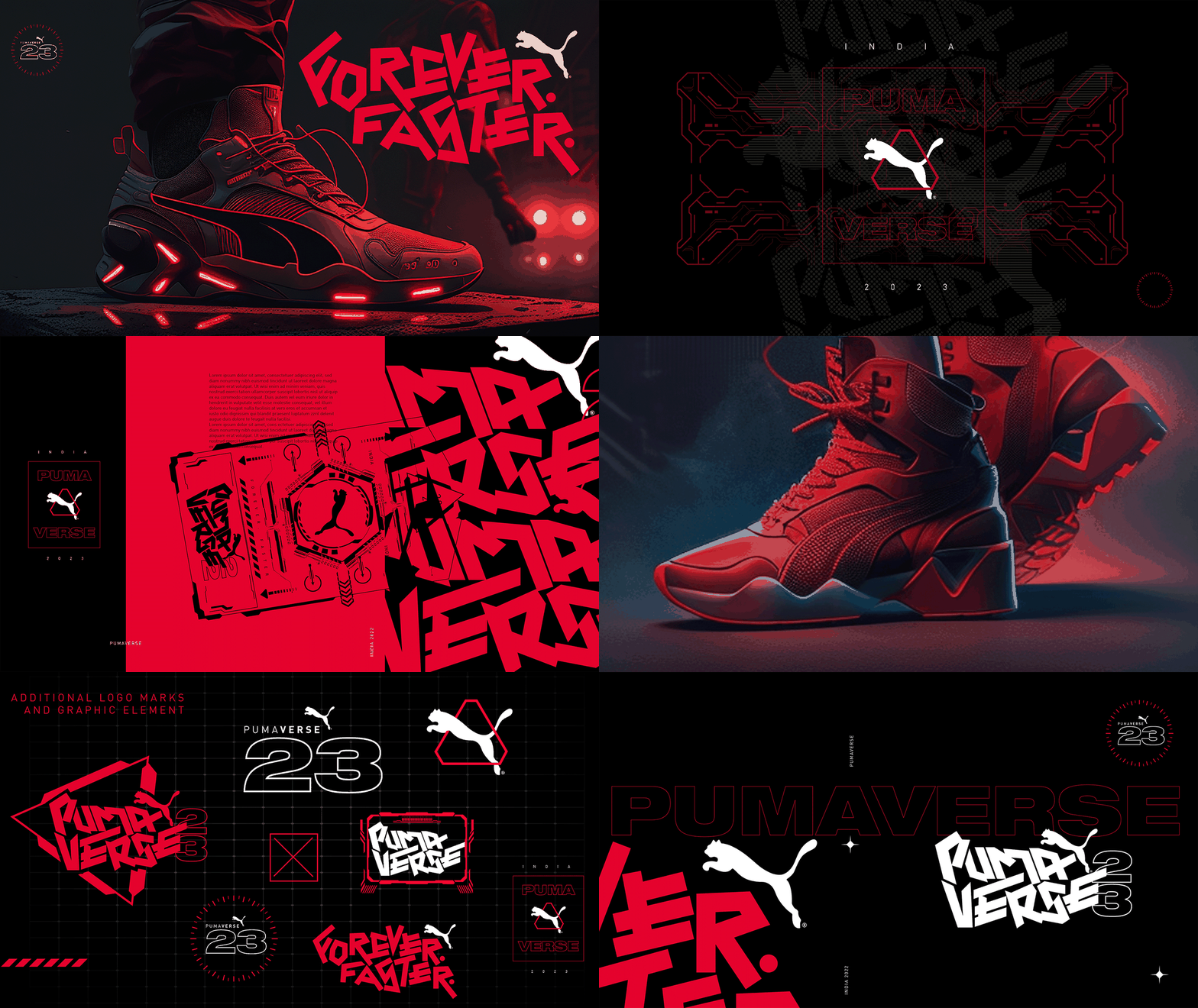
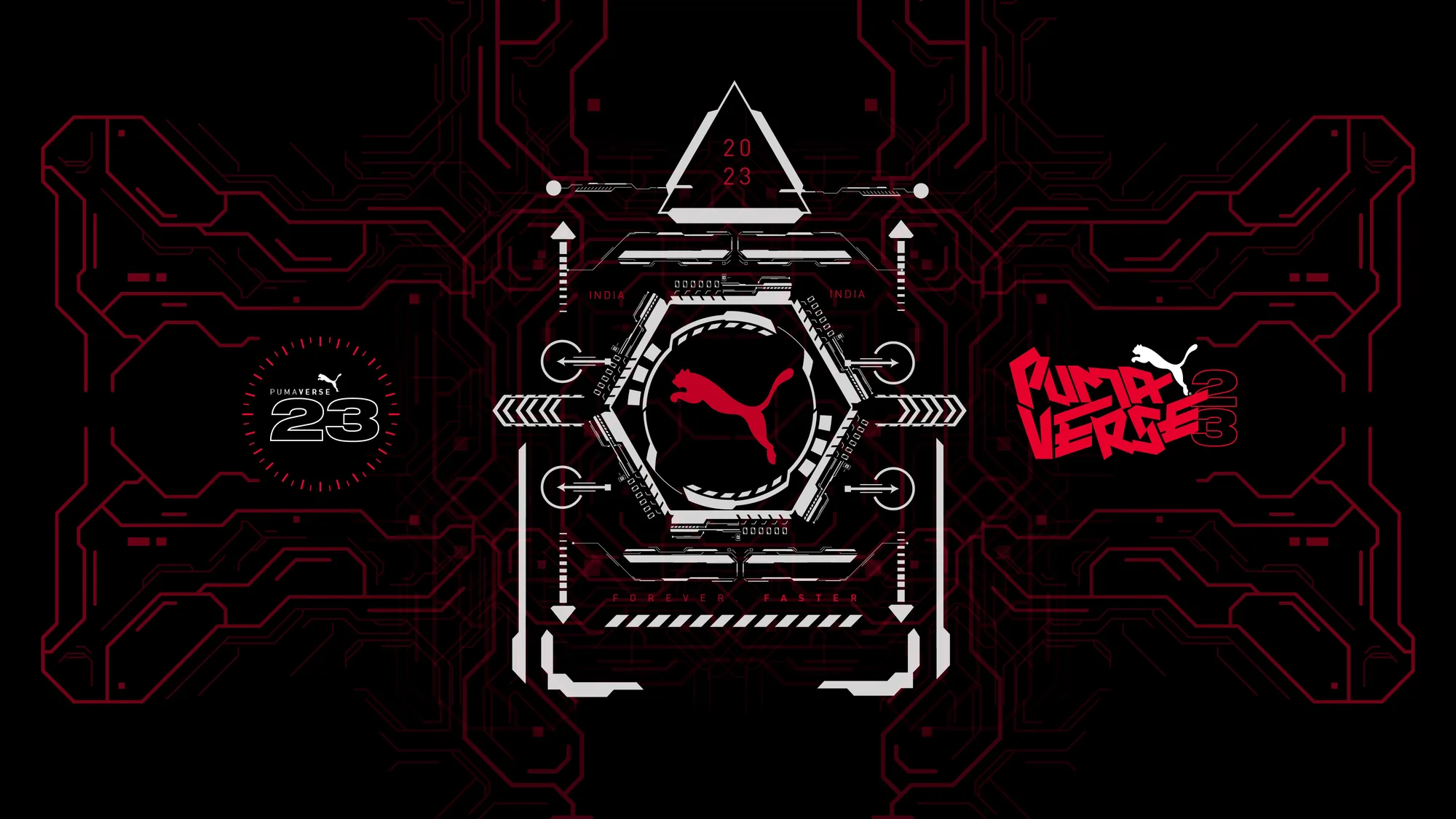
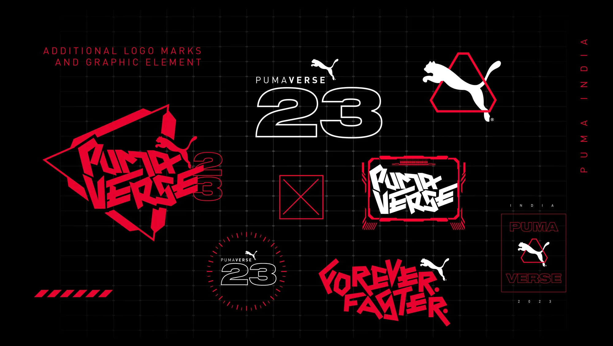
Forever. Faster.
Execution
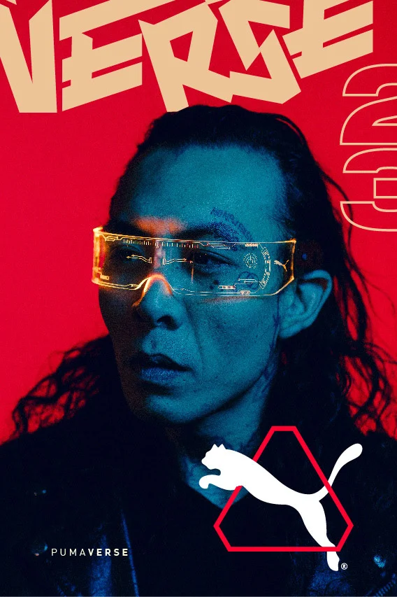
Impact
- 01One hand-built logotype and HUD graphic language, carried from a key visual through the badge system into a full campaign and brand book for Puma India’s flagship event.
Performance brands earn the right to look futuristic when the system is disciplined enough to still feel like one idea (a mark, a dial, a line) no matter how much sci-fi surrounds it.