Sun NXT
One play button. A million stories.
Sun NXT is where five languages of Indian film and TV go to be binged: the app millions open the second a new release drops. Its icon carries that whole feeling in one shape: SUN, NXT, and a play triangle waiting exactly where the N and X cross. This case study starts with that real, shipped icon, then follows a self-directed thought experiment: what would it feel like if that one shape ran the entire app?
Overview
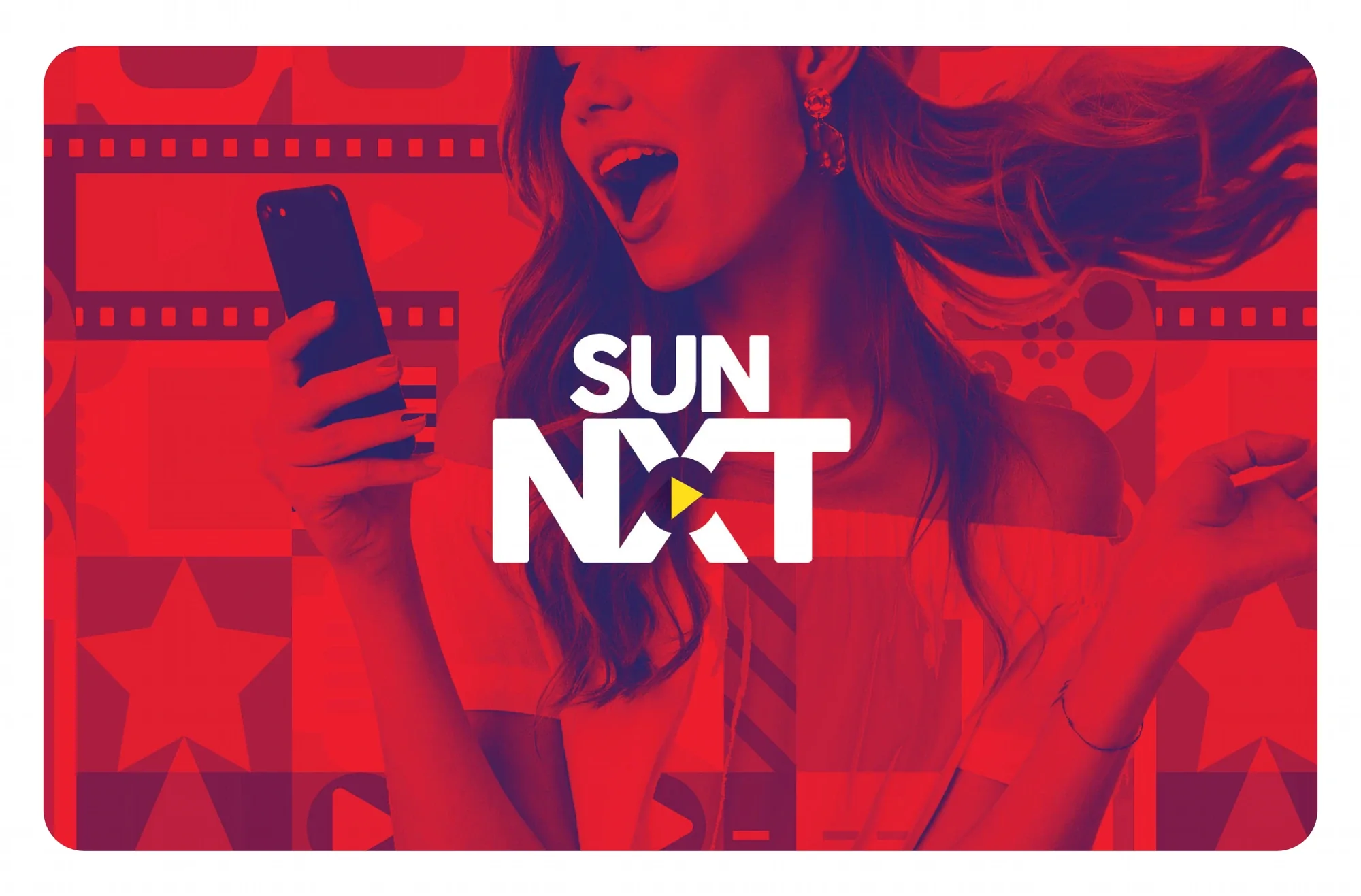
Sun NXT streams films, TV and live sport across Tamil, Telugu, Kannada, Malayalam and Bengali: the kind of app opened in the same breath as ‘what are we watching tonight?’ Its icon is the real, client-approved master: SUN, NXT, and a play triangle sitting in the crossing the two words already make. Every use of it in this case study is unaltered.
Challenge
A streaming icon has two very different jobs: sit quietly correct on a home screen next to fifty other apps, then feel like an invitation the moment someone actually opens it. Past the icon itself, the brief I set myself was to see whether that feeling could survive the trip from a 24px lock-screen badge all the way to a living-room TV, without losing an ounce of its warmth.
What I did
- 01Designed and shipped the SUN NXT app icon: the client-approved master.
- 02Ran a self-directed study in what the icon’s own geometry could become: colour, motion, screens.
- 03Sketched the app’s core viewing moments (home, a film’s detail page, the watchlist) in that language.
- 04Followed the mark wherever an audience actually meets it: the App Store, the TV row, the lock screen.
Approach
Every streaming app needs a play button. Sun NXT’s was already hiding inside its own name: where the N meets the X, a triangle appears for free. So the whole system runs on one rule: don’t invent, discover. The crimson, the gold triangle, the way a title loads in: all of it traces back to that one crossing point, the same way a good show doesn’t announce itself, it just quietly starts.
The system
- Icon System
- Colour & Mood
- The Viewing Screens
- Launch Motion
- On the Big Screen
- Store Presence
Design development
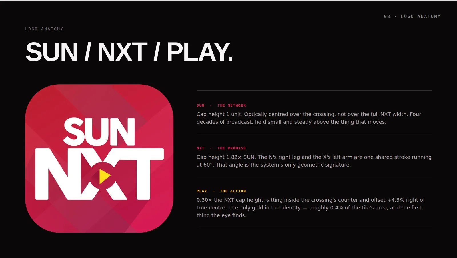
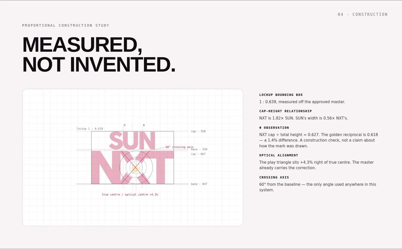
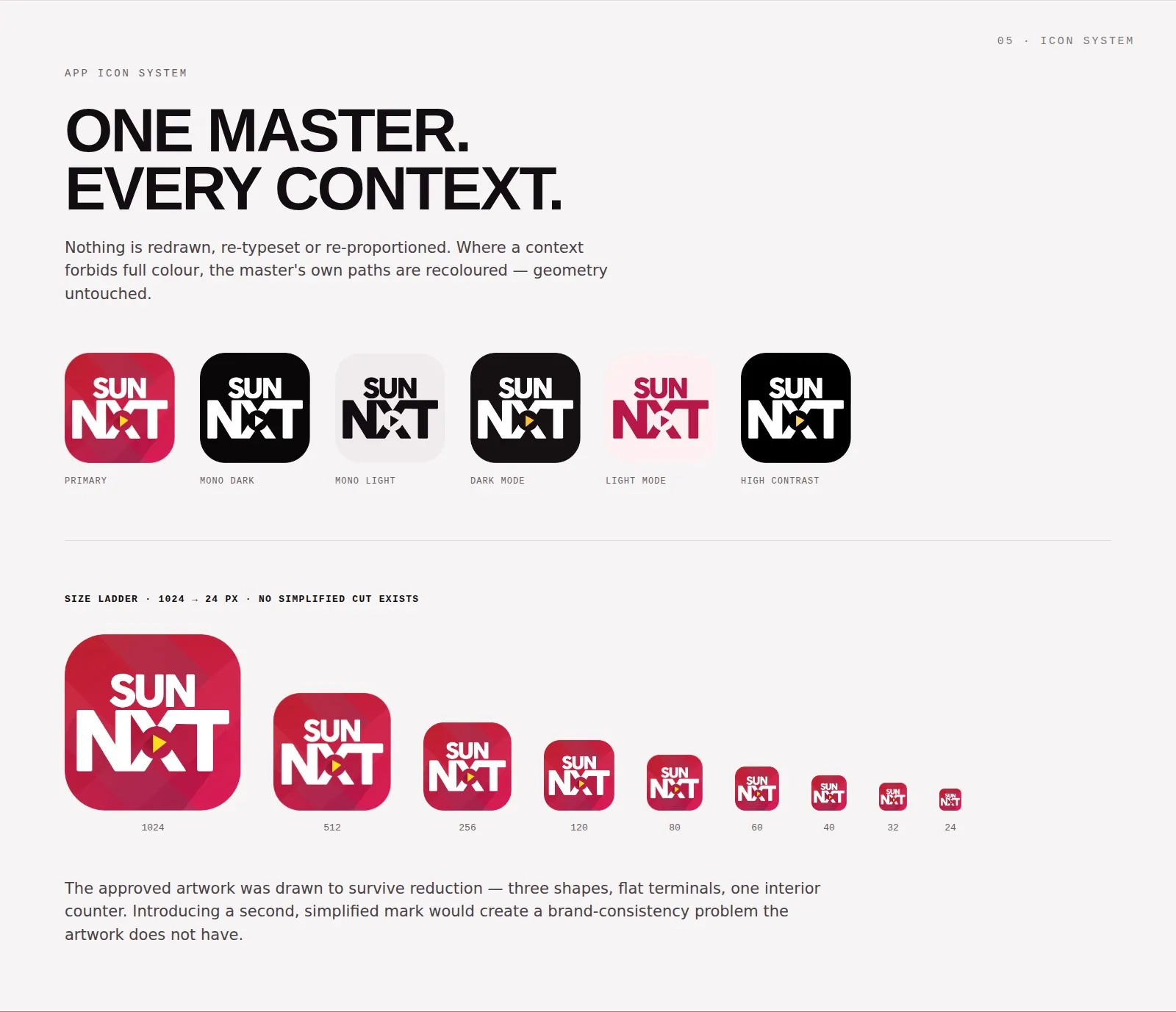
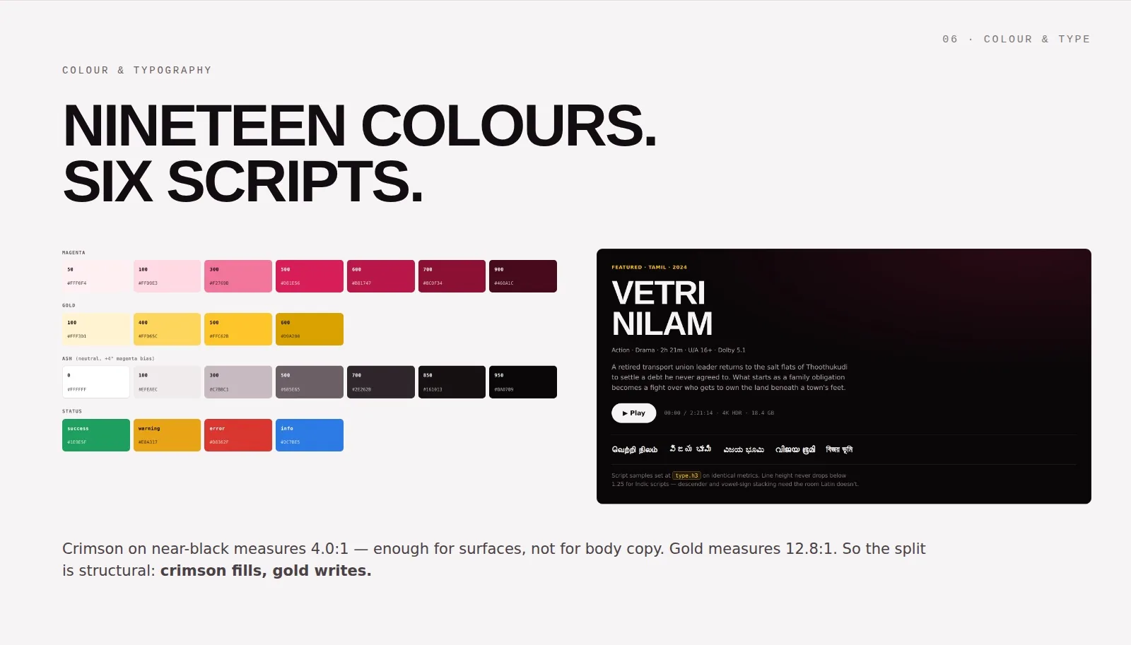
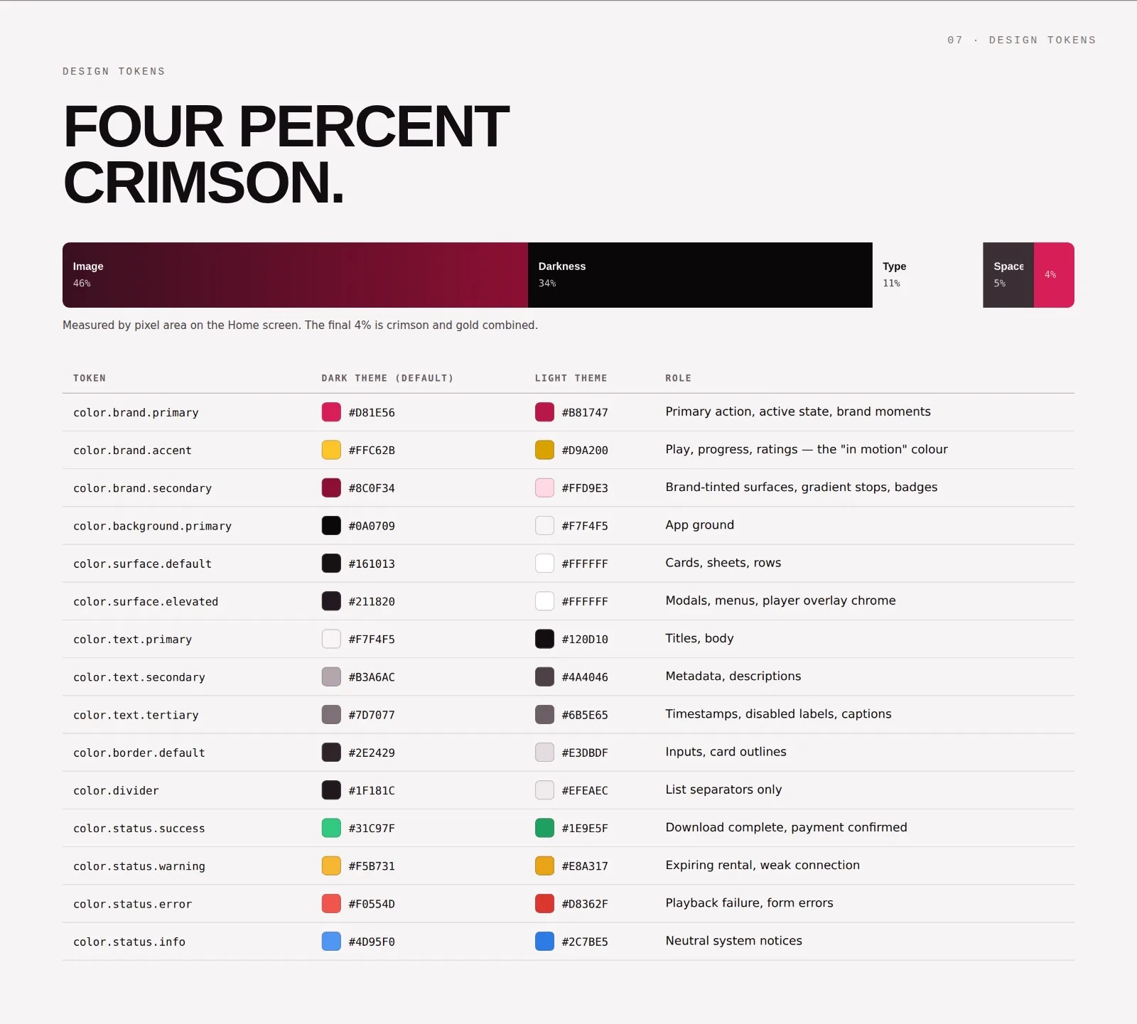
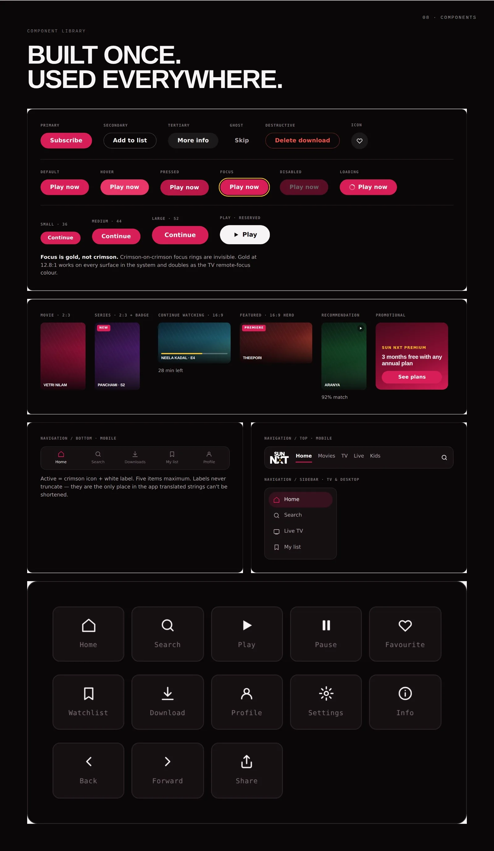
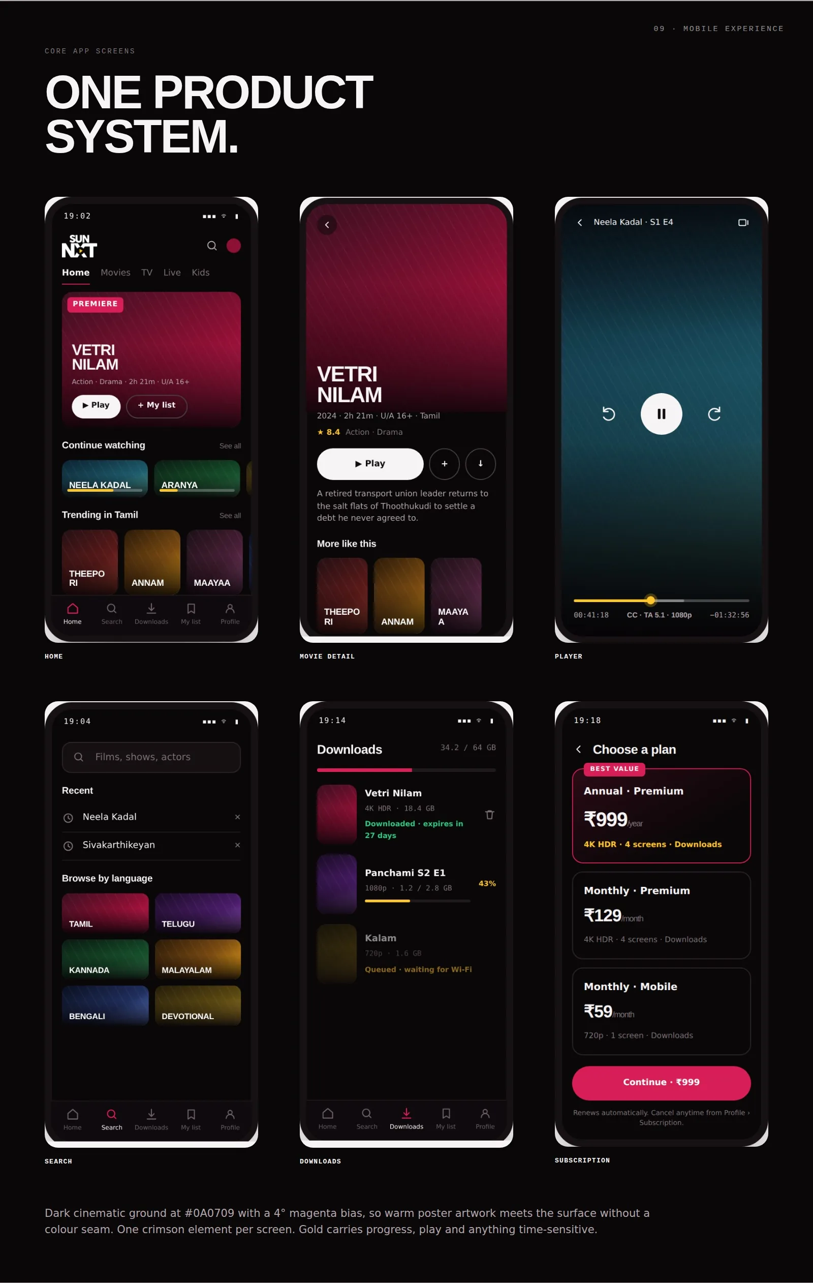
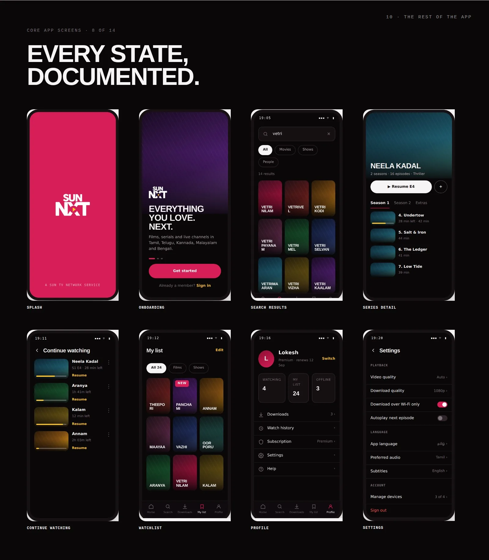
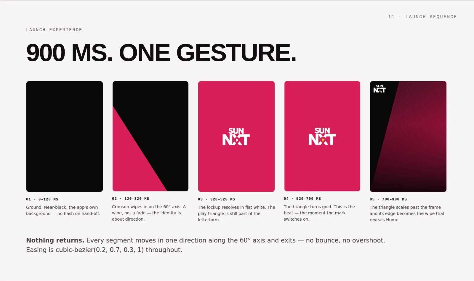
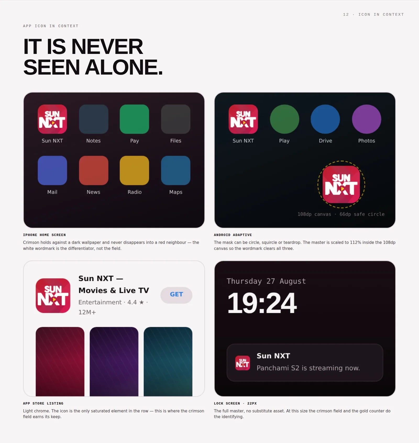
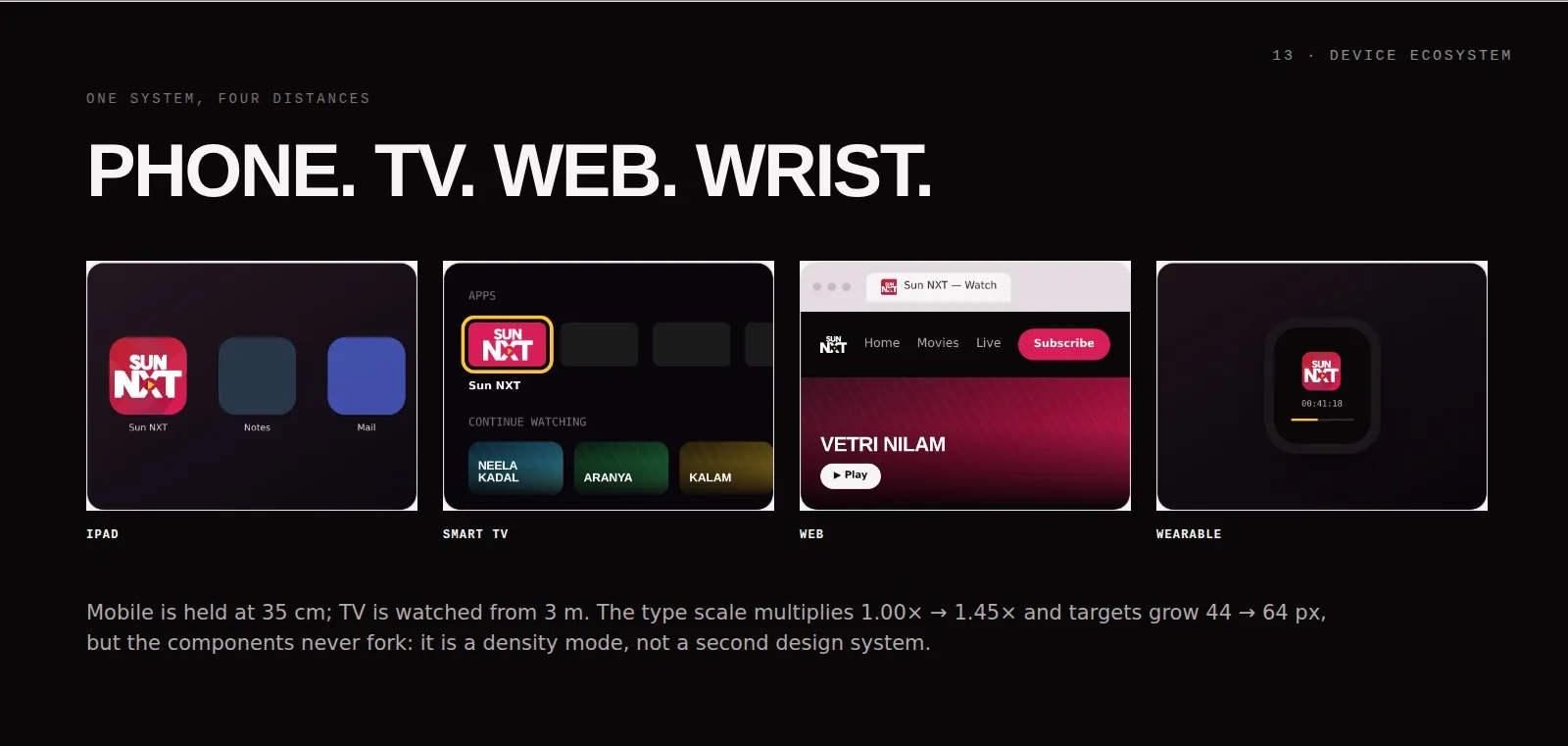
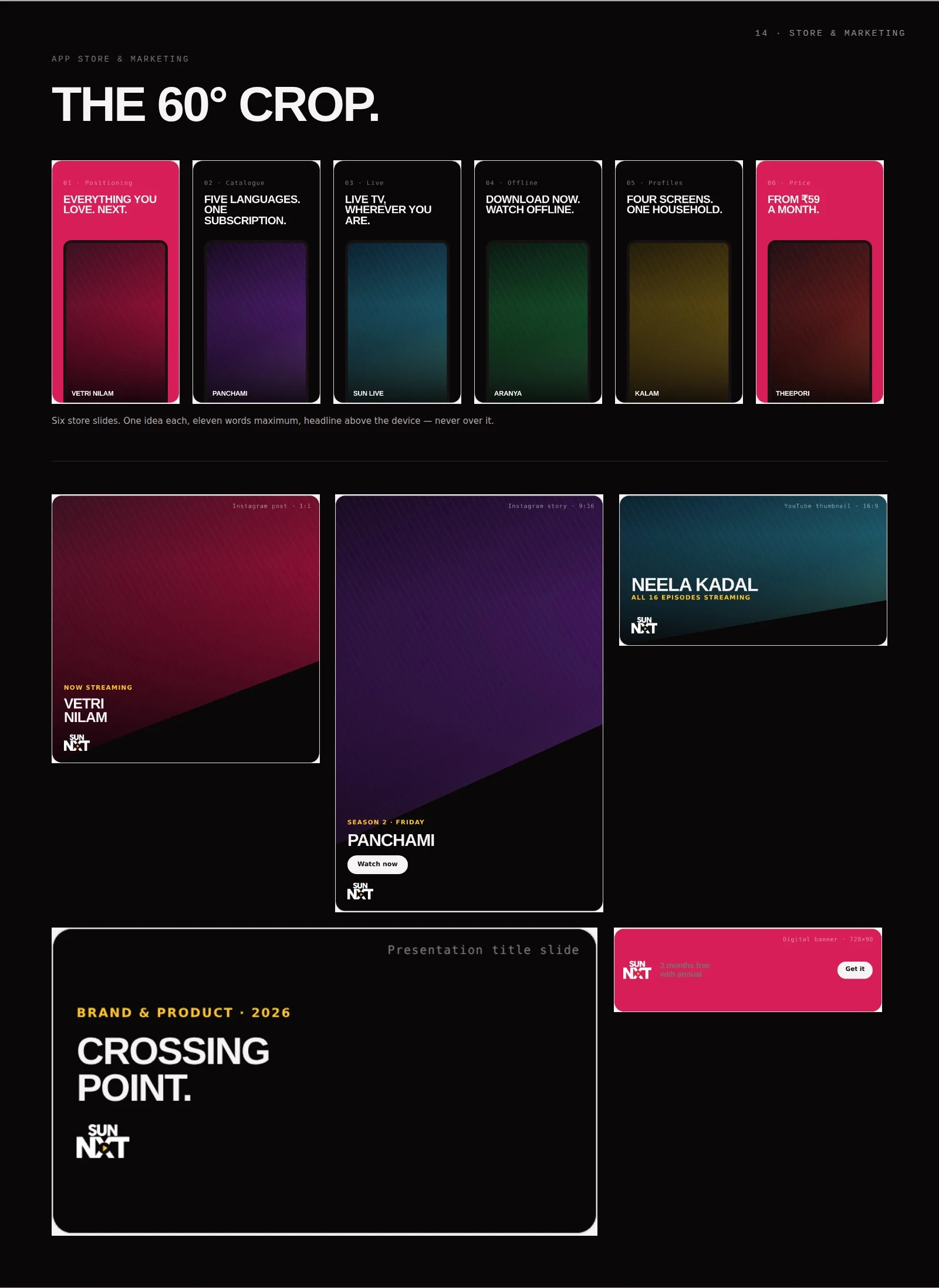
A self-directed concept study extending the real, approved Sun NXT app icon into a full brand world. Poster artwork and titles inside these boards are invented: no third-party film imagery is used.
“The N and the X already share a stroke. Where they cross, the play button sits. That intersection is the whole identity, and everything in this system is built on it.”
Measured, not invented.
Execution
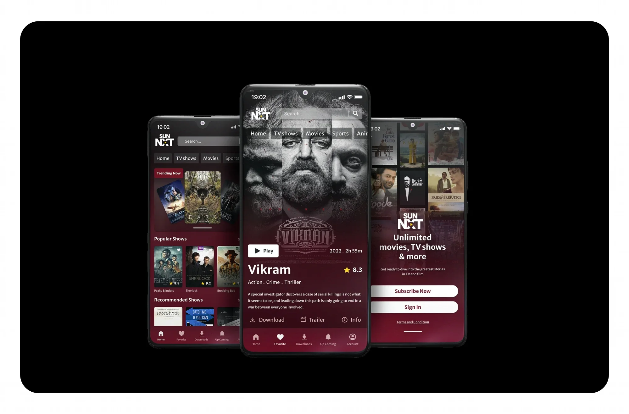
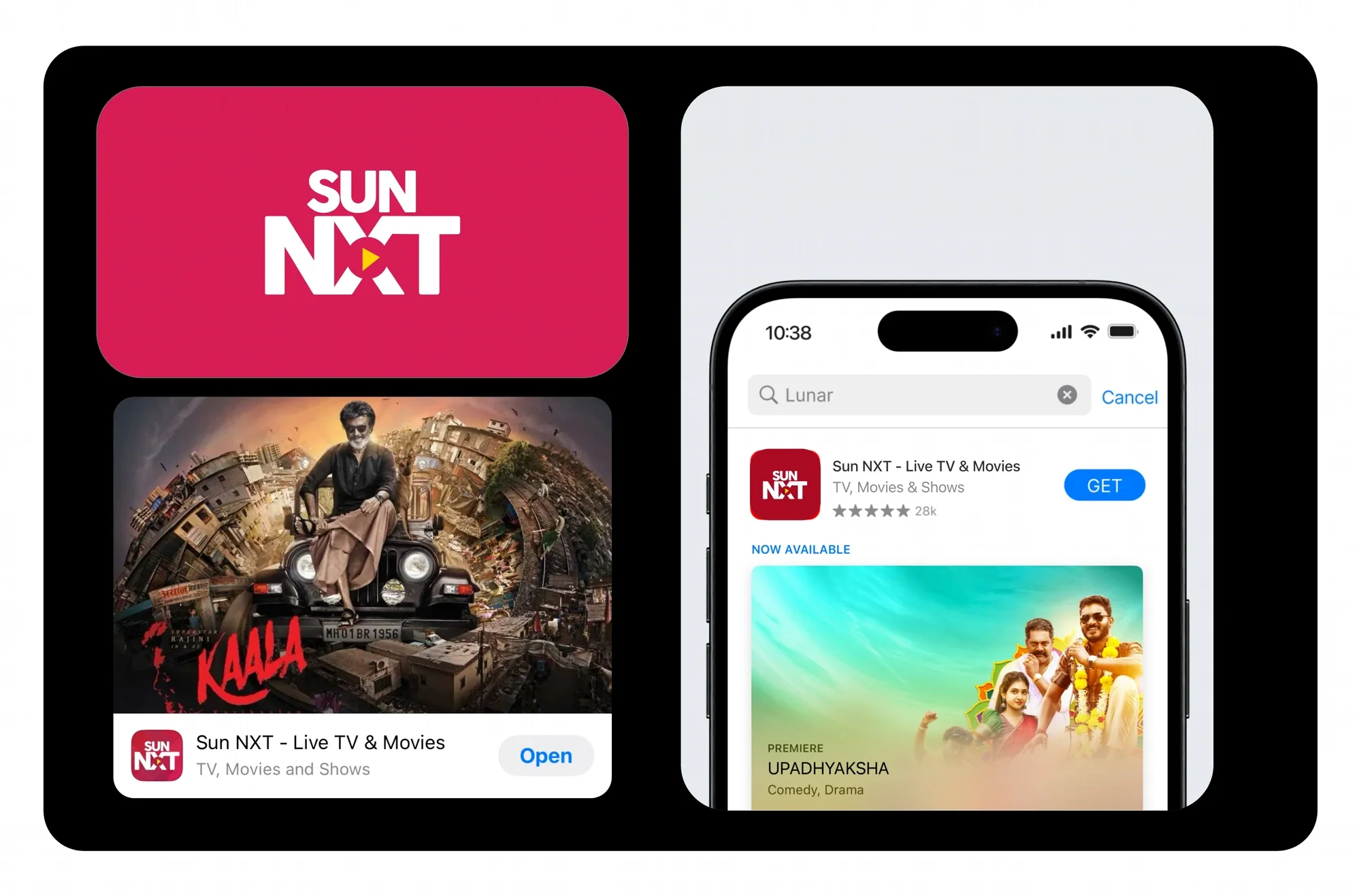
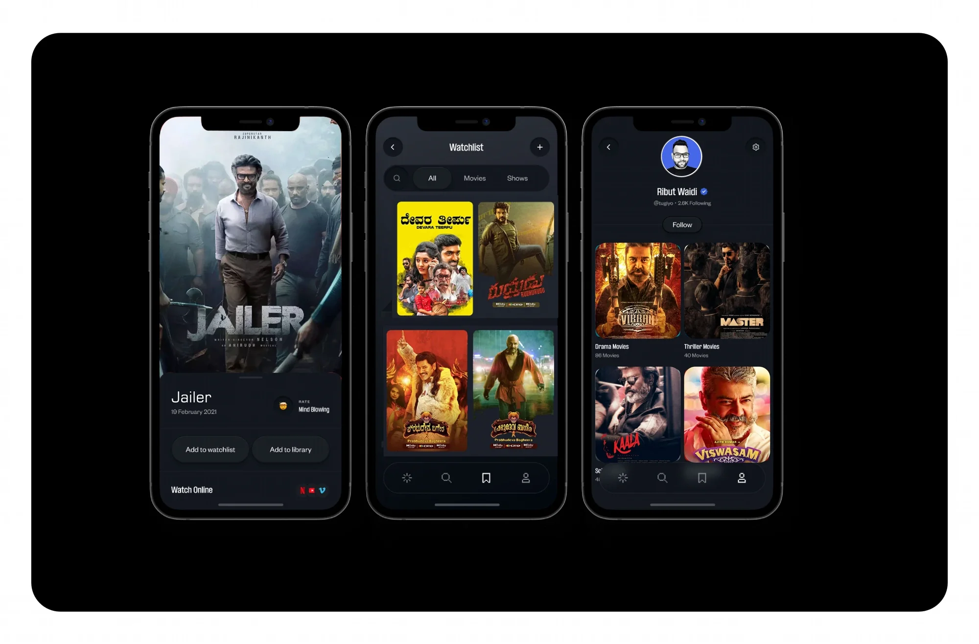
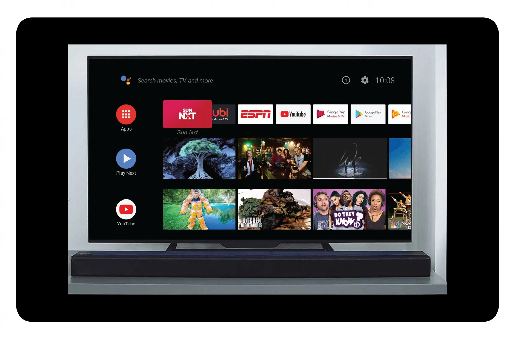
These screens are real: the App Store listing, the TV row, the regional titles. What follows is a self-directed concept study built around them, extending the real, approved icon into a full brand world. Poster artwork inside the concept boards is invented, no third-party film imagery appears there.
Impact
- 01One real, shipped icon: the first thing five language-audiences tap when it’s time to watch something tonight.
The best entertainment icons don’t ask to be admired. They just sit there quietly, promising a good few hours ahead.